Main content:
Super logo - Interview with Joey Badian
The afternoon sun floods into the home office of Joey Badian's Miami Beach penthouse. "It could get a bit loud. My grandchildren are playing outside," says the graphic designer, who was born in 1948. In the 1980s and 90s, he introduced a new typography to Vienna. He still works for some select clients from those days.
Christoph Mandl: You've done a lot of work with brands. What is your personal relationship with brands like? Would you consider yourself someone who likes brands?
Joey Badian: Yes. I definitely like brands, there's no question about it. There's a reason why most of them became brands in the first place. They must have done something right. They must have been high-quality and extremely polished, which in turn made them into a brand.
Christoph Mandl: Are you one of those people who will wear a T-shirt with a brand emblazoned on the front?
Joey Badian: Definitely not. I don't like that kind of thing at all. I like quality and I like design but I don't want a logo on the front. But I just bought a new car and it's actually the same one as I had before. The first thing I realised – I caught myself doing it – was that I hadn't noticed that it says 12V on it when I was outside. I was definitely glad to see that. The 12V is almost more important than the logo.
Christoph Mandl: Brands are often imitated, copied. There is a huge market for fakes.
Joey Badian: Yes, I know. It's probably bigger than the market for the real McCoy. If you think about Asia and all the fakes that are made over there and how many people there buy that stuff, they just have a bigger market for it.
Christoph Mandl: Originals have a certain aura of their own. Or what would you say marks out a fake?
Joey Badian: Some you notice. Some you don't. I'll give you an example. Almost 40 years ago, I was in Morocco where they were selling imitation Louis Vuitton luggage – except it was the real thing. Either it had fallen off the back of a lorry or someone had found it before it got lost again. And another example for you: in shops, they sell olive oil under one name while the exact same olive oil is bottled as an own brand and costs less. It's also a 'fake' but the quality is the same.
Christoph Mandl: So is it the label that imparts that special aura to luxury products?
Joey Badian: It's the price. The price lets you know "I can afford this".
Christoph Mandl: If the price makes the original what it is, what about when it comes to a famous brand? Is the purpose of the advertising budget just to make sure it's perceived as something special?
Joey Badian: That too. Advertising of course adds to the image and therefore also the sense of self-esteem. When I see a famous actor with a perfume and I buy it, I have what he has. I'm happy that I can afford it. That sense of self-worth that you buy with it has a lot to do with it. It's something that doesn't just come from the box or the bottle. It comes from the advertising. There's no question about it, the advertising does most of the work here.
Christoph Mandl: Higher retail prices mean companies can now afford amazing advertising and packaging. There's plenty of room in the budget for all that.
Joey Badian: This helps the brand go from strength to strength and provides an advantage over other brands too, yes. That's the vicious circle.
Christoph Mandl: Discount retailers deliberately position themselves in other segments. They are happy for a product to look cheap because that attracts people to it.
Joey Badian: That's also a form of marketing. You might say that I 'co-invented' clothing in supermarkets. There was no such thing before and for years I'd been placing Moby Dick polo shirts, Stanford shirts and a number of other products in Billa and Merkur. And that of course requires a different type of marketing, packaging and advertising than you need for a €400 polo shirt.
Christoph Mandl: Was that a 'grab-and-go item' in the low-cost segment?
Joey Badian: I talked to management about it and suggested that we package it in such a way that the customer thinks there's something amazing inside. Customers need to believe that a luxury polo shirt has found its way to Billa and it only costs – at that time – 45 schillings.
Christoph Mandl: Regardless of whether you were designing for the luxury or low-cost segment, how could you be sure that your design was unique?
Joey Badian: I always did a lot of research. I was like a journalist. For two years, I was one of Professor Lürzer's lecturers at the University of Applied Arts Vienna and the occasional Anglo-Saxon language slipped out because they had failed to do any research. I once gave them the task of designing a dairy product line, and every time I came I could tell that they hadn't even looked at the competitor products in the supermarket. There wasn't a single milk bottle on the table – they hadn't got a clue. How do they hope to come up with something unique and new if they don't even know what's already out there?
Christoph Mandl: So you never felt distracted by your research or as though it stopped you from coming up with your own ideas?
Joey Badian: There can be no creative output without a bit of input first. On the contrary. That was always my great strength and the reason why I was so quick at coming up with solutions. The more you know, the more references you have in mind, the more knowledge you've collected, the easier the solutions will come. Now when I get a client, a machine factory let's say, I need to learn an enormous amount of information about these machines. Who are they producing the machines for? Who are their customers? How does it work? What's the USP? What makes the machine unique? And all of this, including my own personal knowledge, combines to form the perfect solution. That's why I've always liked working with company owners – without a middleman – because it prevents any information from getting lost.
Christoph Mandl: I read that you went to see building contractor Maculan with your portfolio and then showed him a logo that he hadn't commissioned with the words "and just one more thing."
Joey Badian: No, that's not what happened. I didn't broaden the scope that far. I told him: "I'll now show you all the things you don't need," and I showed him all the logos. He would've accepted any of them. Then I said: "Now I'll show you what you really need." I lost him for a second after that. And then I explained that he has a holding and needs to think ahead. Because the logo provides the corporate design for all the other companies. Everything has to match in a group. I was then able to win him over. He liked the logo because it was quite clever; it included a pyramid, which is always good for construction, an M for Maculan and a commonly used building block. So he was immediately convinced. But I've often had that with clients, where they think they need a tuxedo but in fact they look better in lederhosen.
[Photo: Maculan Holding logo]
Christoph Mandl: When you advise people nowadays, do you think about whether it's possible to protect the logo as a brand too? So that clients can defend their uniqueness?
Joey Badian: I, of course, check whether anything similar exists already. There have been a few times where I've designed something and then suddenly found it somewhere in a specialist publication. That can happen too and it's extremely embarrassing. Forty-five years ago, there was a company called Waldl Sportbekleidung and I designed five trees for its logo with a W in the negative space between them. I still know exactly how I came up with it. I sketched it and suddenly a colleague came over and said "look at this" and it was a logo for something completely different. It used arrows rather than trees but it looked exactly the same.
[Photo: Waldl logo]
Christoph Mandl: So the logo was similar to the one for Waldl but from a different industry?
Joey Badian: Yes and fortunately it was from America too but the shape was almost identical.
Christoph Mandl: Have you often been copied yourself?
Joey Badian: When I graduated from the University of Applied Arts Vienna, I went to Basel to do a postgraduate degree. When I came back, I brought with me a new typography. Some colleagues saw it and said: "You know, we studied your stuff and replicated it." But I took that as a compliment.
One example of where the imitation was really unbelievable is the Franz Klammer line. Franz Klammer came to me with a friend and wanted a logo for a polo shirt. I told him: "Look Mr Klammer, you aren't a fashion expert in my eyes. When I think of fashion, I don't think of Klammer. If you tell me you want to do a ski suit and ski boots, then we can talk." This was the inspiration behind the ideas for the Klammer line. I designed the logo, skis, ski goggles, ski poles and ski suits for him.
Back then, ski suits were all one colour or they had the sleeves and collar in a different colour. The opposite of this would be a patterned design. So I came up with a pattern under crazy time constraints. Then when I was in Italy in the summer, I got the feeling that fluorescent colours were on the way in. So then I had some of the pattern printed in fluorescent colours and designed a few cuts with a colleague. I took some cuts from denim jackets and combined these together. In February, we went to Europe's largest sports show in Munich. And people were saying, that's it, that's what we need instead of all this boring stuff! And six weeks later, all the large companies copied our idea and presented it in Las Vegas. It was a huge compliment to be copied by the world's biggest ski suit manufacturers.
Christoph Mandl: So you didn't try to stop the imitators?
Joey Badian: No. The other companies just took the idea and produced patterns in fluorescent colours too.
Christoph Mandl: Unfortunately the Franz Klammer line didn't last long.
Joey Badian: It didn't last long for two reasons.
A company built carving skis for us and then put them on the market themselves at the same time at a cheaper price. That wouldn't have been a problem really but then came two winters without snow and that drove many bigger companies out of the market.
Christoph Mandl: The story with the carving skis is particularly remarkable. So the Klammer line didn't have the protection of the exclusive rights to the style, design and carving technology.
Joey Badian: We were totally naive. Anyone else would have told the manufacturer: "You can't replicate the skis for another three years."
Christoph Mandl: But you changed the industry. And you changed Austrian newspapers too, together with Oskar Bronner, founder of daily newspaper "Der Standard".
Joey Badian: Oskar Bronner came to me and, because I had a studio that was doing well, I could afford to spend two years working on projects for free. And that was the start of something that lasted 30 years and the only German-language newspaper that didn't need a relaunch. These days, they've made some changes, although I don't think these were entirely necessary.
Christoph Mandl: Where did you find your inspiration? Did you have anything to do with the Viennese art scene back then?
Joey Badian: I know several artists personally but not in the sense that they had any sort of influence on me, definitely not.
Christoph Mandl: So your inspiration came from elsewhere and not the activists?
Joey Badian: I took inspiration from Russian members of the avant-garde who worked in typography.
Christoph Mandl: Have you ever designed political advertising?
Joey Badian: No. I designed some stuff for the campaign to let Jews leave the Soviet Union and came up with some placards. But nothing for parties. I don't like parties and I don't like politicians, even though I'm extremely political. I grew up watching hourly news broadcasts and that hasn't changed to this day.
Christoph Mandl: Which brand would you never design for?
Joey Badian: I'd never design a swastika but I'd gladly come up with a new cross for the church. The cross is a very beautiful, simple symbol but it's absurd. If Jesus' death had been different, who knows what we would've seen in classrooms and on steeples. I prefer something more minimal in any case.
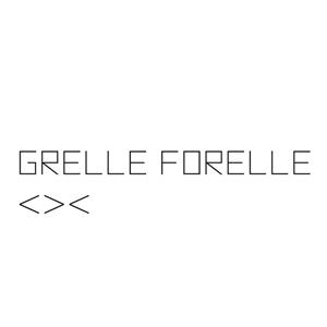
In Vienna, there's a club called "Grelle Forelle" and it has a great logo. I've never been a jealous person, except when it comes to people who can play the piano well. And then there are logos that you wish you'd designed yourself and that's one of them. It's a design I would be proud of.
Christoph Mandl: What advice would you give to young creatives?
Joey Badian: Want to develop a logo? Then do your research like a journalist. And ask the right questions. And only when you know enough – about the product and the competition – should you reach for your pencil, make a note of your thoughts, do a few scribbles and then turn to your computer.
And one more tip: I've often connected the company's initials with an image – a shoe, for example – because that way the logo speaks for itself. But in principle there are no limits to what you can do. Ultimately it needs to look good and sell.
End
04. May 2021